Thursday, June 25, 2009

Score!

Check out this lamp I found yesterday for my client whose moving to Los Angeles.  I snagged a pair of them while shopping at an outlet store no less.    Plastic wrap included. 

It's going to be perfect in her beach house with her white slip covered furniture.  A touch of modern and a touch of california beach.  Perfection.  
  
My husband is in love and is hoping she doesn't want them!   Sorry honey, clients come first.  


Tuesday, June 23, 2009

Palmer Weiss

With a play date of four year old boys under way at my house,  I'm loving the relaxed style of Palmer Weiss.  I'm having technical difficulties so check out her website. 

It's no wonder she was one of Domino's designers to watch in 2008. 

While most of her portfolio is sunny southern california preppy, her neutral rooms make me take a deep breath.   They combine the perfect amount of sophistication with livable materials giving the rooms a relaxed feel.  

Now, imagine these rooms with Star Wars action figures and Nerf Dart gun bullets everywhere. Perfection!

Friday, June 19, 2009

Shelter Sadness

I know, everyone has been posting about the same thing. However, there's nothing as depressing as wanting to buy a new home magazine and not being able to do so.

Unfortunately, no matter how hard I try, I can't seem to find anything to replace the shelter magazines we've lost over the past couple months. I'll pop into local newstands to see if I can find anything that peaks my interest. I'll stand there waiting for something to magically appear - lifting the magazines to see if something great has been buried behind them.

Don't get me wrong. I enjoy Traditional Home, House Beautiful, Elle Decor, Southern Accents, and Veranda, but they are all beginning to feel the same. We can't resort to the European magazines as they have a different aesthetic.

Where's the achievable, livable design that was featured in Cottage Living and Domino. Where are the homes of non-celebrities and undiscovered interior designers? Where's the mix of high and low? Where are the houses targeted to the young professionals and young families?

Is anyone in the publishing industry listening? I'm not going to make it through this recession without some great home inspiration.

Wednesday, June 10, 2009

Chocolate, Cream and Aqua

Flipping through this months House Beautiful, two rooms caught my eye. A rustic, yet sophisticated bedroom by Albert Hadley and a fun, whimsical dining area by Jonathan Berger. Both have warm chocolate backgrounds with pops of aqua and cream. They are completely different, yet both feel fresh and contemporary. I don't think I'm ever going to get tired of this color combination. Although it is so overused it always makes me feel happy. What do you think? Are you tired of it or do you think it's a classic?

Albert Hadley bedroom. I love the pale aqua bed with the rustic English Regency bench. The symmetry of the tables and lamps is perfect. The mismatched paintings is a nice touch. This room is so simple yet inviting.

Jonathan Berger dining room. The coral memo board is outrageous - I love it! I also love the bright aqua chairs. Plus their kid friendly with the leather upholstery. The back of the chairs have a coral print fabric to tie into the coral Murano glass chandelier. (Not crazy about the coral color or the fan on the wall) But, overall this room is fun and casual.

Friday, June 5, 2009

To Family Photo or Not To Family Photo?

That is the question of the day. How do you display your family photos in a beautiful, elegant and personal way in your house?

There are many thoughts on this subject. Some say that family photos should be in non-public areas of the house. Which means they are off limits in the living room, dining room, family room and kitchen. However, some also say that they shouldn't be in private areas of the house like your bedroom as well. What is a homeowner to do?

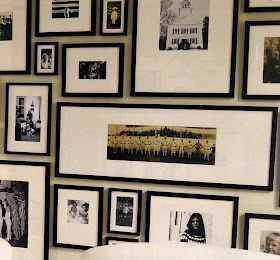
I believe your treasured family photos can be in any room of your house as long as you make a statement with them. That means a couple things:

1) Pick a frame color and style. The key is to keep the frame style consistent. If you want to mix it up, you can mix together black and white frames, or gold and silver frames, as long as they are the same frame style.

2) Can you vary the size of the frames? Yes, but only if it takes up most of the wall. Varied size frames look best on walls with angles like a staircase. Arrange them in a staggered pattern that follows the angle of the wall. Remember to allow breathing room between the frames. The size of the breathing room is up to you.

3) Pick a focus wall and use the entire space to make a statement. Nothing looks worse than a bunch of little picture frames on a large wall. I love a collection of photos in all one size frame with a large mat. You photos are transformed into artwork.

4) Black and white. If your photos are color, convert them to black and white to unify the space. It's especially important if you are varying your frame sizes and colors.

If you make a statement with your photos, you can hang them in any room you want.